
Case Studies
If you would like see a specific service, click on the service you’d like to learn more.
Lettering, book cover design, visual identity, workshops, events and lettering and marvellous murals.
Inspiring children's creativity with lettering through creative collaboration and bold lettering

“ Lyn’s ability to break down concepts for the target audience and her general writing skills were excellent.
Lyn is excellent at communicating with ultra polite, friendly updates, detailed drafts and artwork always submitted on the day promised. The most impressive part of working with Lyn was the finished artwork she produced for us. The quality of her beautiful lettering and illustration was well above and beyond expectations and her files were immaculate. We are so thrilled with the final outcome of this project and thoroughly enjoyed working with Lyn throughout the process.”
Adam Carruthers
Head of Design at Tiger Tribe


Client
Tiger Tribe
Service
Lettering, illustration, instructional manual and content, and book cover design.
Background
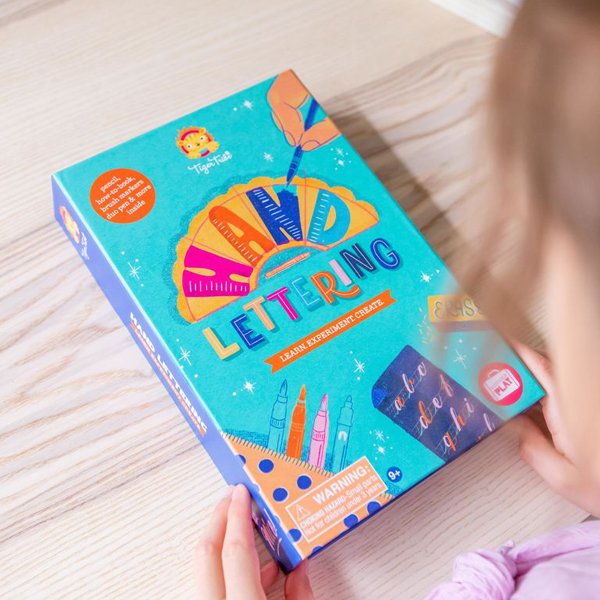
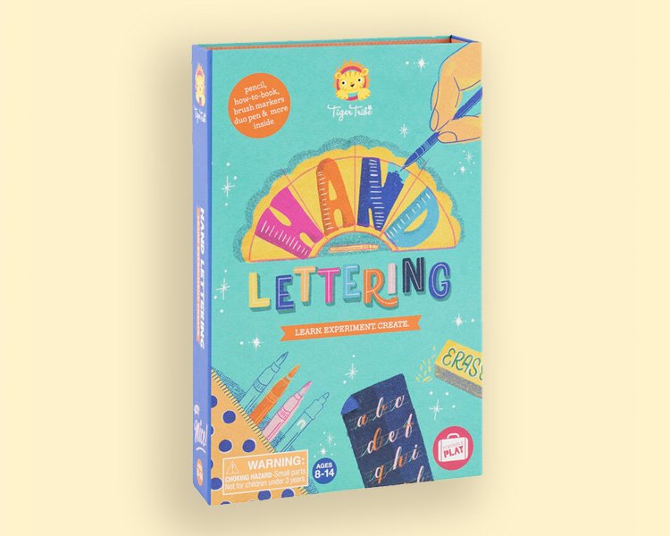
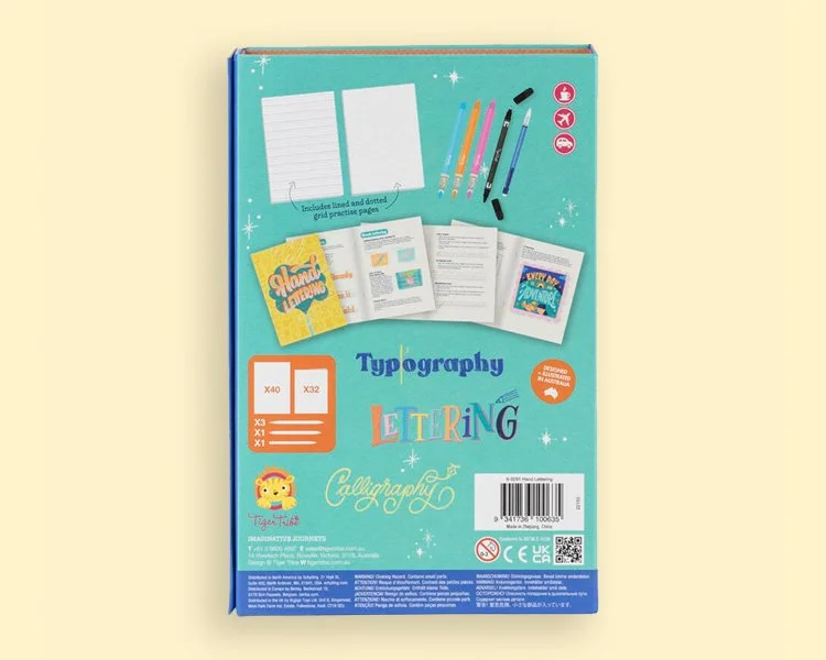
Following the success of the first edition of The Lovely Book of Lettering, Tiger Tribe sought collaboration to create a sequel Lettering Book, aiming to inspire children to tell stories through letters.
Brief
The project aimed to inspire children to tell stories through letters by providing step-by-step instructions and fun applications to use their new learnings.It involved creating simple and easy-to-understand exercises to encourage kids to craft their lettering. The overarching goal was to promote creativity, emphasising progress over perfection.
The secret sauce
Leveraging teaching experience, I simplified lettering theory and designed engaging activities to enjoy their lettering journey. Combining bold colours, organic textures with dynamic lettering and illustrations, created a distinctive and fun shelf appeal.
The result
The project stands out with vibrant lettering and illustrations through creative collaboration. The book was able to ignite and foster kids' creativity, motivating them to tell stories with letters. The one-of-a-kind cover art was memorable in creating shelf appeal, converting potential browsers into buyers.
Credit
Lettering, illustration, instructional manual and book cover design by Lyn Tran, graphic design by Tiger Tribe, photography by Tiger Tribe.
You can nab your hand lettering kit, here.

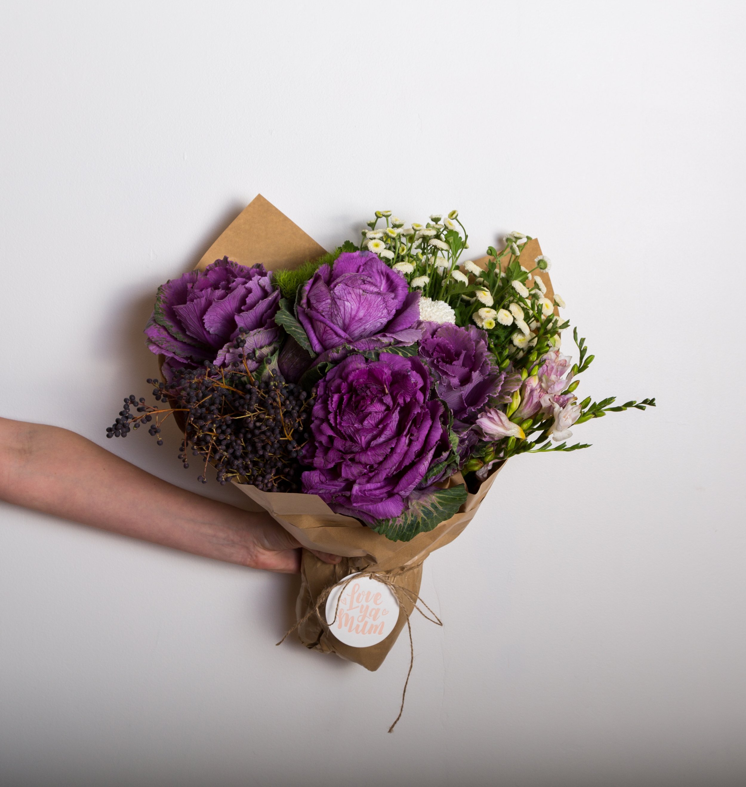
Community art spreading positivity for mental health week

“Lyn’s commitment to her craft is second to none and it really shows. Everything she touches comes together with the greatest skill and care, and we couldn’t have been happier with the result. The colours, the illustrations, the lettering – all perfect. We still get compliments about this piece today. Thank you Lyn!“
Kate McLean
Director, Little jar of happiness


Client
Little jar of happiness
Service
Lettering and mural
Background
Little jar of happiness supports Beyond Blue by donating a share of their profits. One of their most important days in their calendar is World Mental Health Week. 1 in 5 Australians are affected by mental illness, yet many do not seek help because of the stigma.
Brief
To design and hand paint a mural that would reflect the positive impact that flowers have on mental health.
The secret sauce
Drawing inspiration from Kate's passion for flowers and their therapeutic effects,
the design aimed to capture the essence of joy and hope that blooms bring to individuals' lives.
The result
Spreading positivity within the local community for World Mental Health Week. And encouraging locals to check in with their loved ones. Lastly, a cheeky selfie for the gram.
Credit
Lettering, design and mural by Lyn Tran
Photography
Lauren Peters @meandmygirl and Sophie Timothy

Increased customer engagement with personalised journals

“Thank you so much for everything, and being such a dream to work with.
We were able increase our engagement as well as attract new customers with the live lettering.
It was such a successful activation.”
Brittany Kerin
PR Executive Sportscraft, SABA & JAG


Client
SABA
Service
Live lettering activation
Background
SABA is an Australian clothing label that focuses on contemporary mens and womens fashion.
Brief
To increase foot traffic, sales and brand awareness for Mother’s Day, we initiated a live lettering activation.
The result
We successfully created a personal experience that increased brand engagement and awareness with new and existing customers. As well as adding infinitely shareable content (hell social media opportunities!) for SABA.
Credit
Lettering by Lyn Tran, photography and video by Haven Images, location at David Jones Bourke Street Mall, Melbourne.
Increasing brand awareness through spreading Christmas cheer

“Lyn is an absolute dream to work with! Her bubbly, lovely personality makes it a super fun process, and her work speaks for itself - just beautiful. 10/10 communication, clarity in expectations, and meeting of deadlines. On this specific job, Lyn was tasked with creating typography out of cake - exploring different icing, decorations, levels of detail etc - and she made the process as fun as it sounds!”
Haley Polacik
Executive Producer, pixel.melbourne


Client
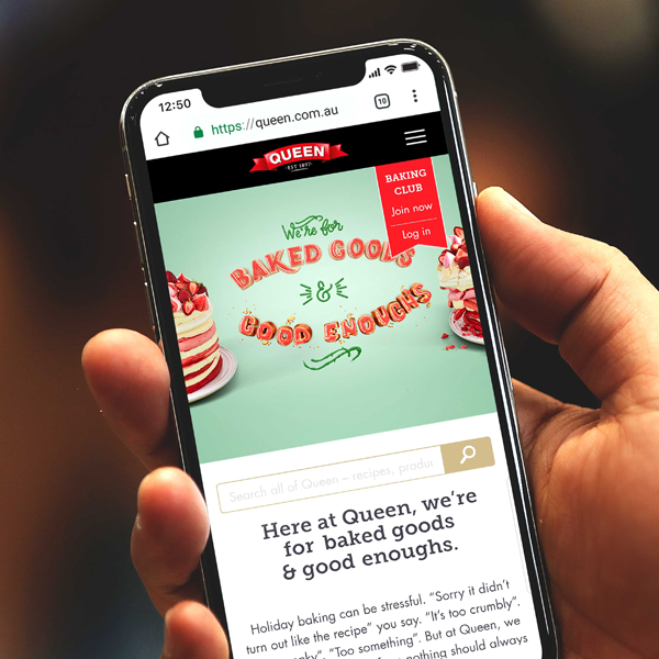
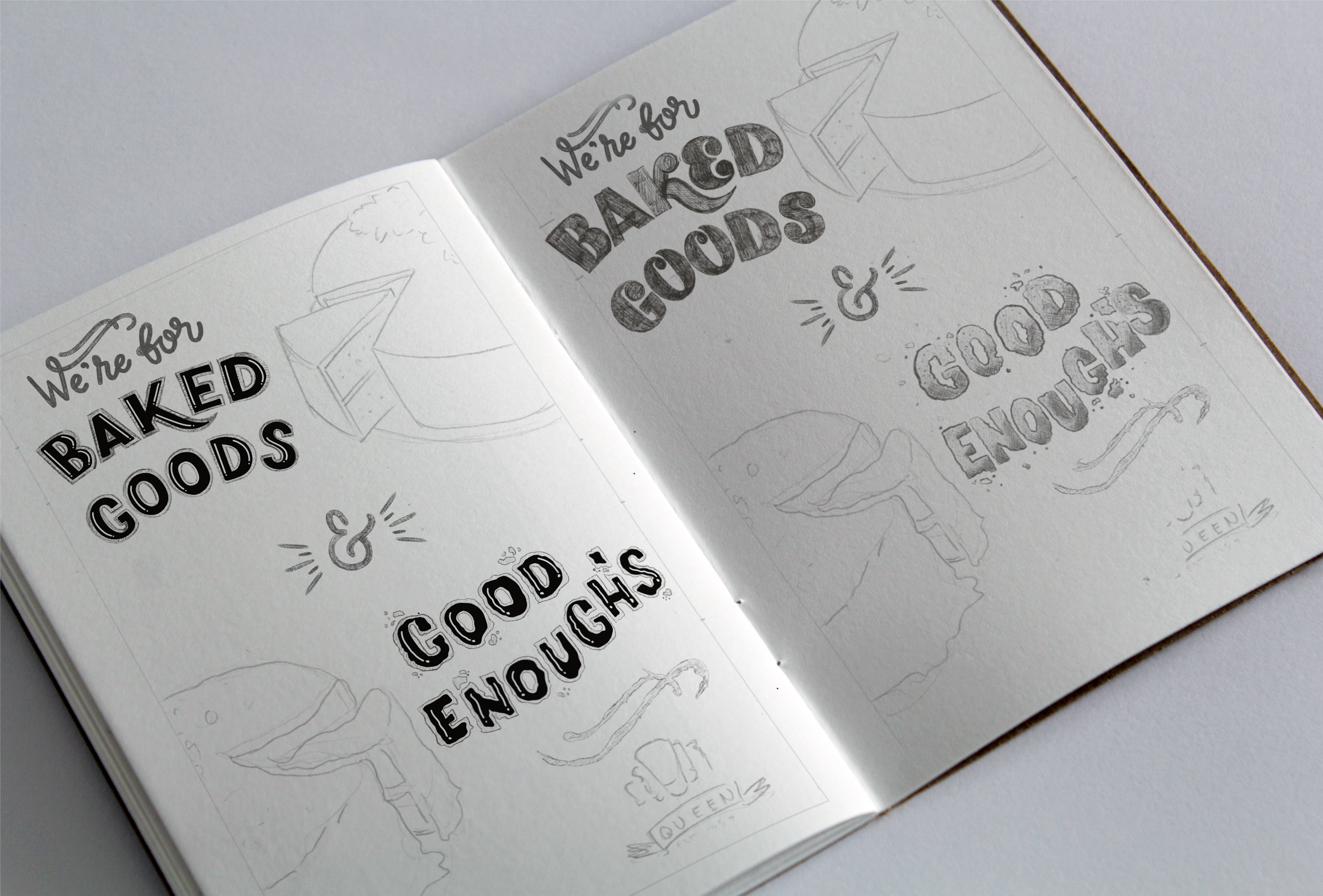
Queen fine foods
Service
Logo lock up and lettering for ad campaign
Background
Queen Fine Foods, a leading Australian producer of baking aids, aimed to inject festive spirit into their brand with a playful Christmas campaign. They wanted to evoke excitement for the holiday season and encourage baking enthusiasts to embrace the joy of creating delicious treats.
Brief
The task was to design a logo lock-up and hand-lettering that reflected the diverse personalities of home bakers, aligning with the theme of "apology-free baking." The objective was to create a visually appealing campaign that would resonate with consumers and spread Christmas cheer
The secret sauce
To emphasise the authenticity of human imperfection, the focus was on incorporating tactile and handmade elements into the design. The goal was to create a lettering lock-up that visually mirrored the styles of both a professional baker and a casual enthusiast. Exploring various techniques to infuse character into the lettering, the design struck a balance with the strong imagery of cakes, capturing the essence of both skillful craftsmanship and playful experimentation.
The result
The collaborative effort produced a visually captivating campaign that celebrated both Christmas and the joy of baking. The logo lock-up, hand-lettering, and engaging digital illustrations resonated with consumers, fostering excitement for the festive season. This impactful campaign not only increased brand awareness for Queen Fine Foods but also spread Christmas cheer and inspired consumers to indulge in the pleasures of baking during the holiday season.
Credit
Lettering by Lyn Tran, digital illustration by Courtney Hopkinson, represented by Watermark, production agency by ./pixel, art direction by BWM Dentsu.

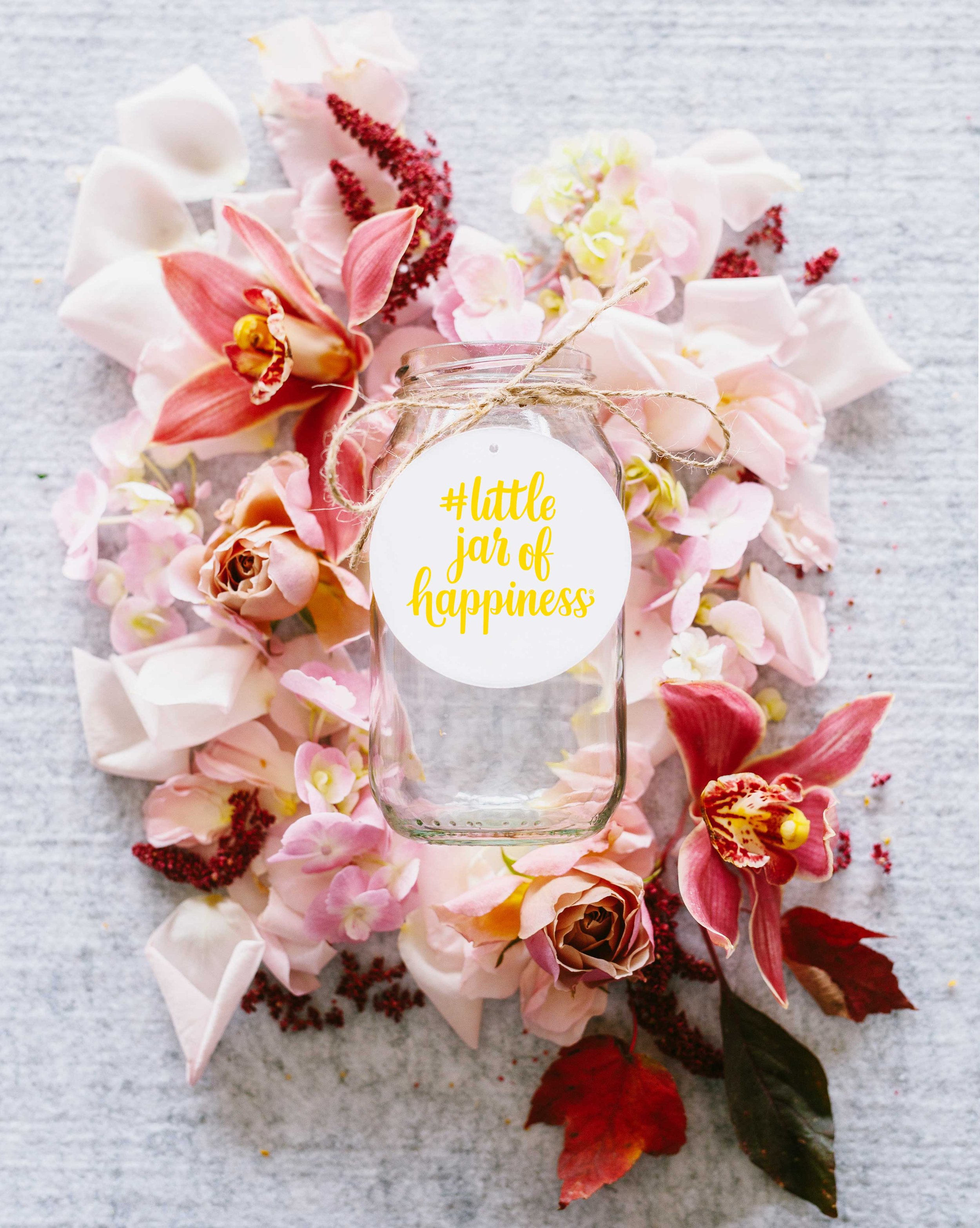
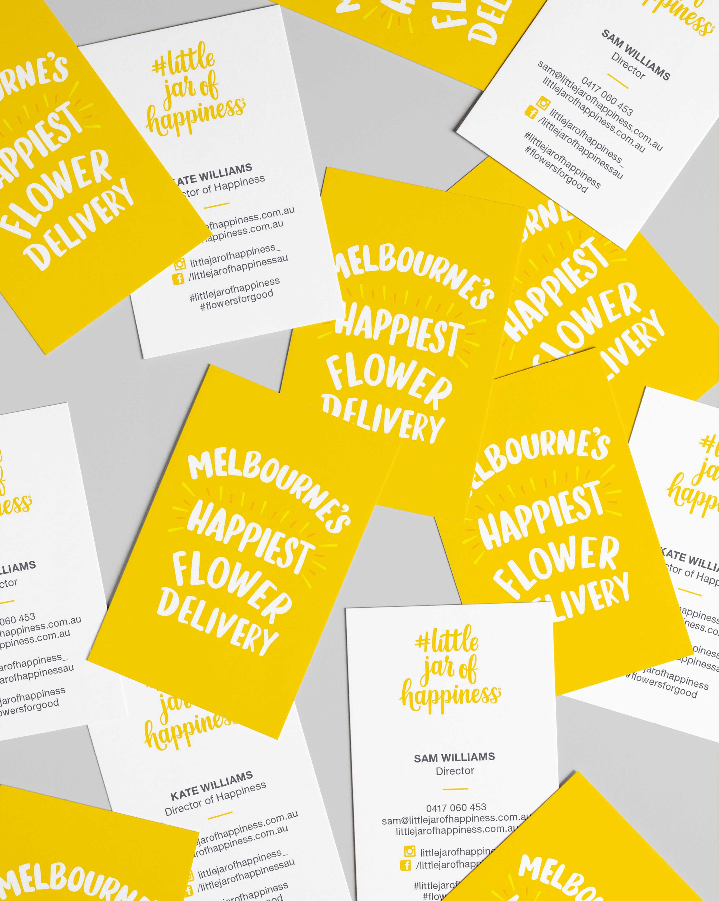
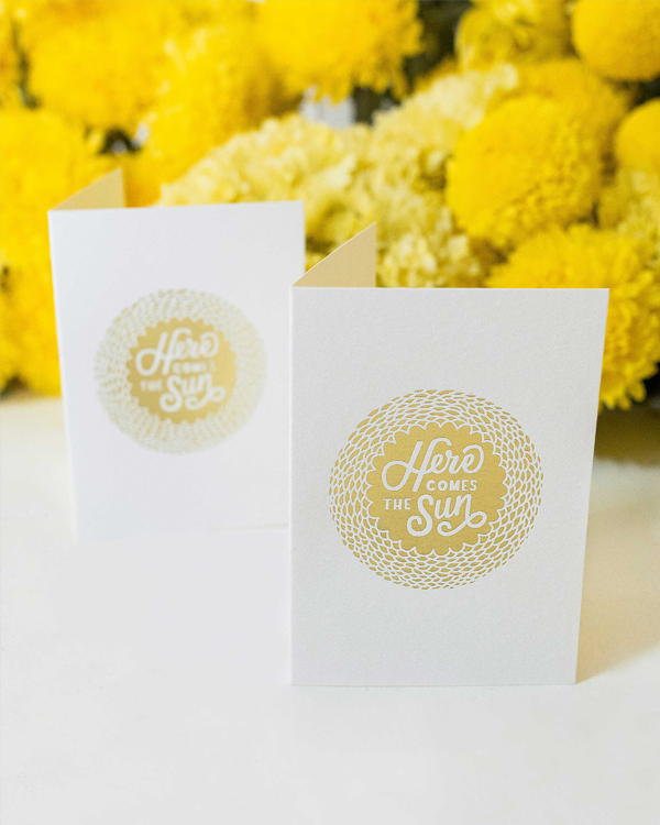
Cheery branding becomes Melbourne’s happiest flower delivery

“Lyn knows just how to create something unique and full of personality, and how to translate that personality into a distinct and memorable brand identity. We are so thrilled we had her to help us bring our brand vision to life. Love your work, Lyn!”
Kate McLean
Director, Little jar of happiness


Client
Little jar of happiness
Service
Brand identity, lettering, illustration, pre-press management, stationery design and graphic design
Background
Little jar of happiness is the happiest flower delivery in Melbourne. They specialise in creating statement blooms and naturally styled flowers for every occasion.
Brief
To craft a visual identity that authentically captured the essence of Little Jar of Happiness. With Kate's vibrant personality and love for flowers at the heart of the brand, the goal was to create an identity that resonated deeply with flower enthusiasts, reflecting Kate's passion and spirit.
The secret sauce
Kate's infectious joy and hands-on approach to crafting loose, natural statement blooms inspired the branding. To represent Kate's essence, I designed a distinct hand-lettered logo using a brush and ink, capturing the joy of working with her hands. Each stroke formed unique and organic shapes, embodying her warmth, authenticity, and happiness.
The result
An unforgettable brand identity that flower lovers and customers associate happiness with. A brand that has now become Melbourne’s happiest flower delivery service.
Credit
Lettering and branding by Lyn Tran, letterpress by Saint Gertrude, foil printing by Mickey loves Jacqui and photography by Sophie Timothy and Steph Wallis.
Some of our fab and fun clients
If you would like to chat to me about your branding and visual communication needs click here.

